

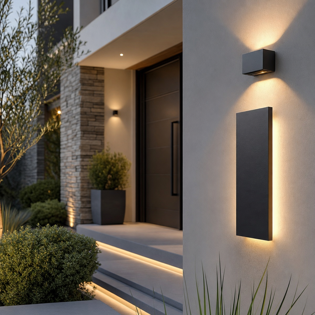
When most homeowners think about curb appeal, they focus on landscaping, paint colors, or a new front door. Yet one of the most overlooked details — house numbers — can quietly define the entire personality of a home’s facade. The right set of numerals communicates style, precision, and pride of ownership before a visitor even reaches the front step. In recent years, the shift toward cleaner architectural lines and minimalist design has made address signage a genuine design statement rather than a mere functional necessity.
The Role of Address Signage in Exterior Design
Exterior design is a discipline built on cohesion. Every element — from the texture of the siding to the finish on the door hardware — contributes to a unified visual narrative. House numbers, despite their small scale, occupy a prominent position on the facade and are among the first details the eye lands on. When they clash with the overall aesthetic, the dissonance is subtle but real. When they harmonize, they reinforce the design intent with quiet authority.
Architects and interior designers have long understood that typography carries emotional weight. A bold sans-serif numeral mounted in brushed stainless steel reads as contemporary and confident. A hand-painted ceramic tile number evokes Mediterranean warmth. A backlit floating digit suggests luxury and precision. The choice of address signage is, in essence, a typographic and material decision — one that deserves the same thoughtfulness applied to any other exterior finish.
Material Matters: Choosing the Right Finish
The material of your house numbers must withstand weather, UV exposure, and the test of time while maintaining visual integrity. Powder-coated aluminum offers durability without the weight of solid metal. Stainless steel resists corrosion and maintains its luster through seasons of rain and sun. Brass develops a patina that many homeowners find desirable, lending a sense of age and character. Each material carries its own maintenance requirements and visual personality, and the best choice depends on both the climate and the architectural style of the home.
Mounting style is equally important. Flush-mounted numbers sit flat against the wall and read as clean and integrated. Standoff-mounted numbers project slightly from the surface, creating a shadow line that adds depth and dimension — particularly effective in raking afternoon light. Some homeowners opt for address plaques that frame the numbers within a panel, offering a more traditional or formal presentation.
Modern Exterior Trends and the Numbers That Complement Them
Contemporary home design has embraced a vocabulary of flat rooflines, large windows, horizontal cladding, and restrained color palettes. Within this aesthetic, modern exterior house design principles emphasize the elimination of unnecessary ornamentation and the elevation of functional elements into design features. House numbers fit naturally into this philosophy — they are inherently functional, yet their form can be refined to the point of artistry.
Horizontal arrangements of numbers, spaced generously and mounted at eye level, align with the strong horizontal emphasis of contemporary facades. Vertical stacking, by contrast, suits narrow entryways or modern townhouses where vertical lines dominate. The scale of the numerals should be proportional to the wall surface — oversized numbers on a modest facade can feel aggressive, while undersized numbers on a grand entry wall appear timid and hard to read from the street.
Legibility and Safety: The Practical Dimension
Beyond aesthetics, house numbers serve a critical safety function. Emergency responders, delivery drivers, and visitors all depend on clear, readable address signage. High contrast between the numeral and the mounting surface is essential — dark numbers on a light wall, or illuminated numbers against a dark facade, ensure visibility at a glance. Reflective finishes and integrated LED lighting extend legibility into nighttime hours, a feature that is both practical and visually striking.
Local municipalities often have regulations governing the minimum size and visibility of address numbers, particularly for emergency access. Before selecting a style, it is worth confirming that the chosen design meets local code requirements. Fortunately, most contemporary address number systems are designed with both compliance and aesthetics in mind, making it straightforward to satisfy both demands simultaneously.
A Closer Look at Modern House Numbers as a Design Brand
Modern House Numbers has built a reputation around the idea that address signage deserves the same design attention as any other architectural detail. Their catalog spans a range of typographic styles, materials, and mounting configurations, allowing homeowners and designers to find a solution that genuinely complements the home’s exterior language. Whether the project calls for sleek brushed aluminum on a mid-century modern ranch or bold matte black numerals on a new-construction contemporary, the selection reflects a deep understanding of how typography and material interact with architecture.
Integrating Address Numbers into a Broader Design Vision
The most successful exterior renovations treat every element as part of a coordinated whole. House numbers should be selected in conversation with door hardware, light fixture finishes, mailbox design, and even the color of the front door. A matte black numeral pairs naturally with matte black door handles and a black-framed lantern. Brushed nickel numbers echo the finish of contemporary sconces. This kind of material coordination, even at a small scale, creates the sense of intentionality that distinguishes a thoughtfully designed home from one that has simply accumulated improvements over time.
As design experts have noted, the details of a home’s exterior communicate volumes about the care and taste of its owners. Address numbers, precisely because they are so often overlooked, offer an opportunity to signal design literacy in a subtle and understated way. Choosing numbers that are well-proportioned, well-made, and well-suited to the architecture is a small investment with a disproportionate visual return.
Making the Right Choice for Your Home
Selecting house numbers is ultimately an exercise in understanding your home’s architectural identity and finding signage that speaks the same visual language. Begin by identifying the dominant material palette of your exterior — wood, stone, stucco, metal cladding — and look for numbers whose material and finish create either a harmonious echo or a deliberate, considered contrast. Consider the scale of your facade and the distance from which the numbers will typically be read. Think about lighting conditions at different times of day and whether illuminated options would serve both function and atmosphere.
Take time to study the typography of the numerals themselves. Some fonts carry historical associations — serif styles evoke tradition and formality, while geometric sans-serifs feel contemporary and precise. The spacing between digits, the weight of the strokes, and the overall proportions all contribute to the final impression. These are not trivial considerations; they are the same decisions that graphic designers and architects make when crafting a building’s identity.
Conclusion
In the broader conversation about curb appeal and exterior design, house numbers occupy a small but meaningful place. They are among the few elements of a home’s facade that combine pure function with genuine design opportunity. Approached thoughtfully, they become a finishing touch that ties together the exterior’s visual story — a detail so well-chosen that it feels inevitable, as though the house could not possibly wear any other numbers. That quality of inevitability is the hallmark of good design, and it is entirely achievable with the right selection and a clear understanding of what your home’s exterior is trying to say.
